Data Visualization & Infographics
Whether it’s explaining a process, illustrating relationships, or displaying information, the right visualization can bring data to life.
Philadelphia Navy Yard
Maskar worked with AECOM to create maps of proposed improvements for transportation systems throughout the Navy Yard.

AIDS Activities Coordinating Office
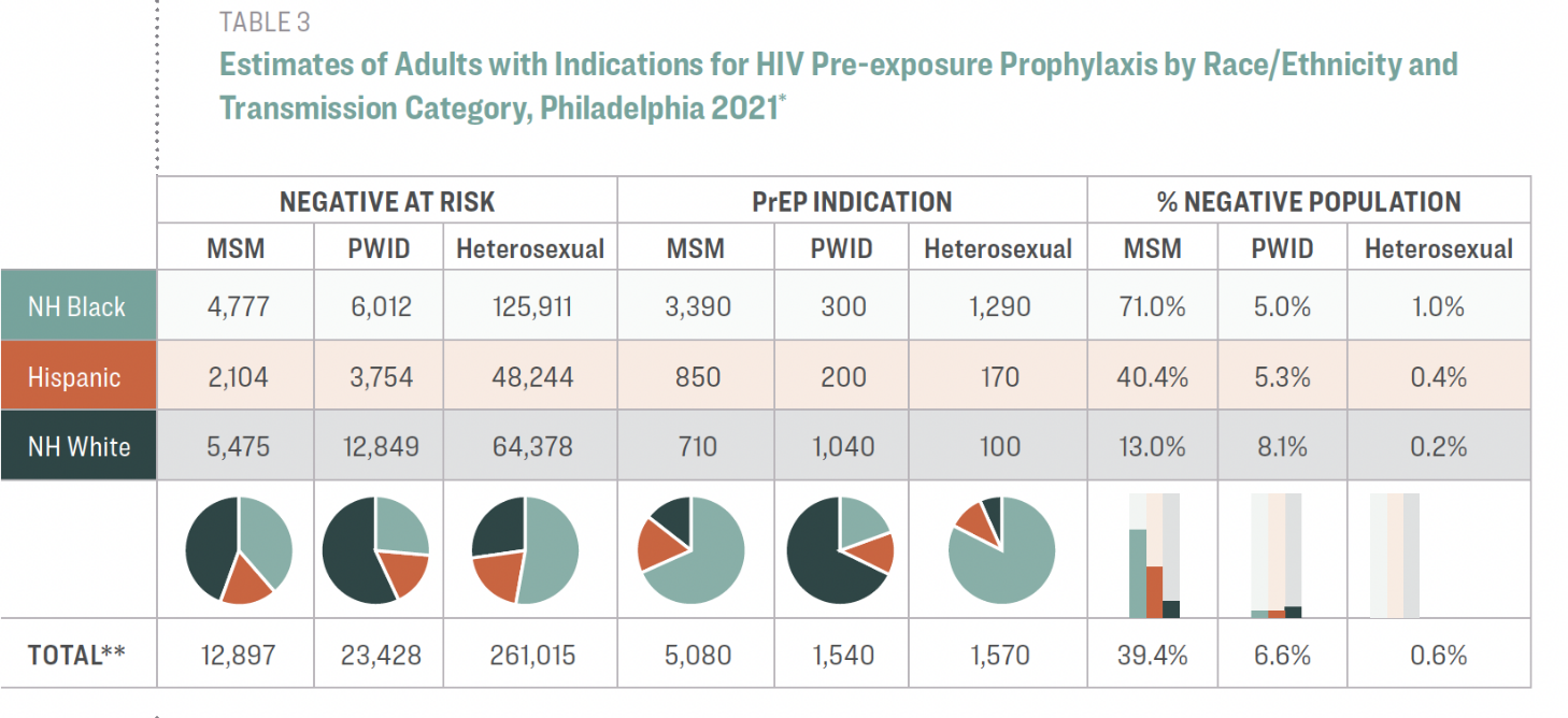
The addition of small charts in tabular statistics can increase rapid comprehension of the data, as in this excerpt from the annual surveillance report on HIV in Philadelphia.
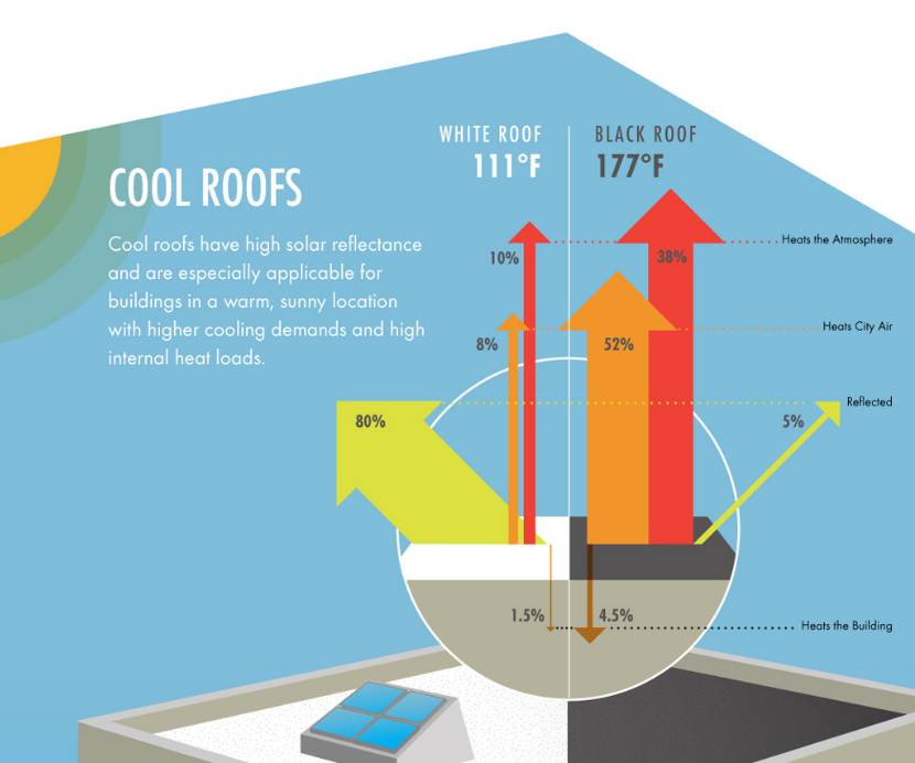
Consortium for Building Energy Innovation
The Consortium for Building Energy Innovation is a multidisciplinary collaboration of universities, private sector technology companies, and economic development agencies formed to focus on developing solutions to address the energy efficiency in existing small- and medium-size commercial buildings.
As part of the project, Maskar created educational infographics that detailed approaches for creating energy-efficient retrofits.

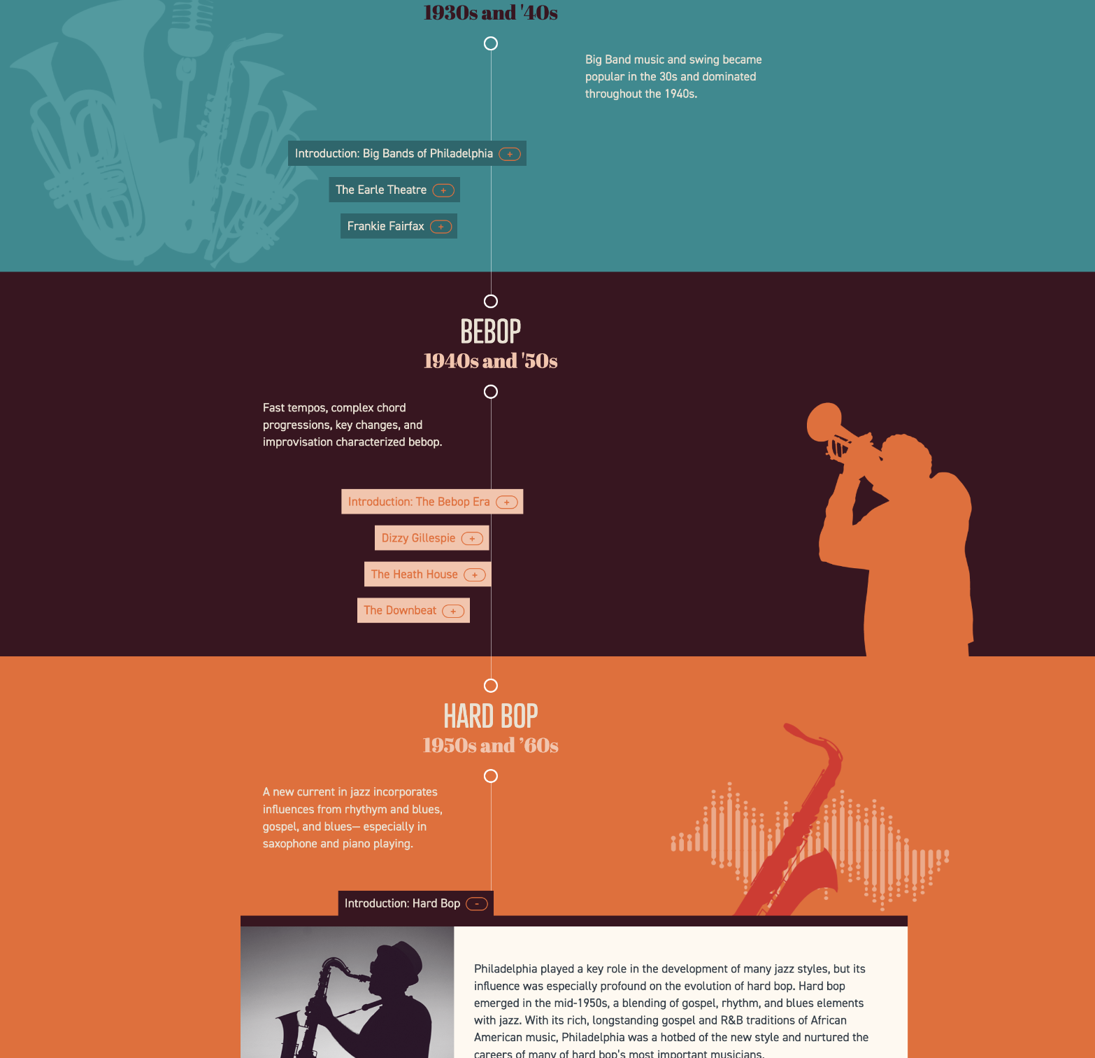
Jazz Philadelphia
For the Jazz Philadelphia website, we created a vertical timeline of jazz periods and the artists who represent them.
Each timeline entry opens up to show biographies and Spotify playlists for the artist.

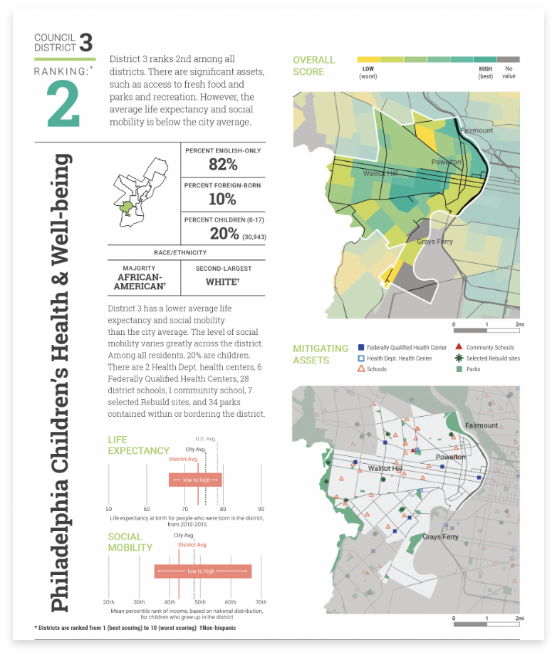
Scattergood Foundation
Working with the Scattergood Foundation and data from Azavea, we created a series of cards for each Philadelphia Council District that ranked their performance on factors related to children’s health and well-being. Maps provided overall scores within each district, along with mitigating assets, such as schools, parks, and health centers. Life expectancy and social mobility scores were compared to city averages and showed low to high ranges.


ImpactEd, University of Pennsylvania
The School District of Philadelphia developed a theory of change for creating community, fulfillment, and joy through its enrichment programs. ImpactEd asked Maskar to help visualize how its components worked together and to design the report outlining the outcomes and impact of implementation.

Avalon Nature Preserve
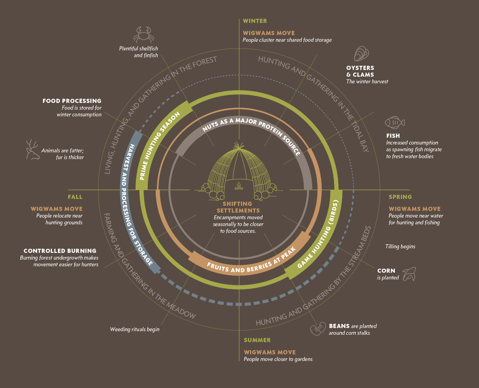
This diagram illustrates the seasonal migration of native settlements on Long Island and the cycle of harvesting and major food sources used throughout the year.
For a deeper look at the brand identity established for Avalon, see our Avalon case study.