Included here are some of our favorite data visualizations… from the complex to the refreshingly simple.
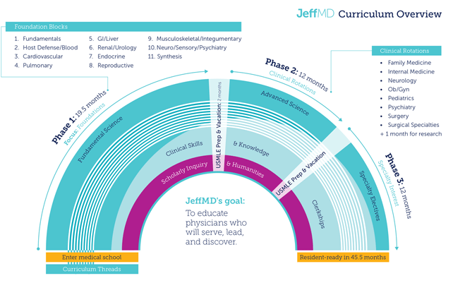
Visualization of Jefferson’s student curriculum from medical school entrance to resident readiness
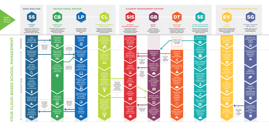
Diagram of product offerings for OnCourse Education Systems
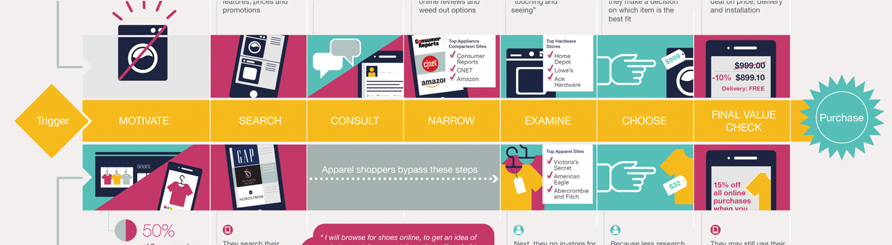
Diagramming a typical shopper’s journey
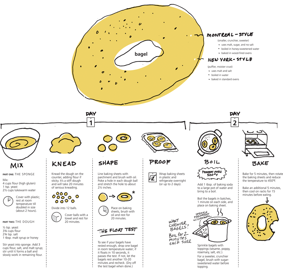
Ever want to know how to make your own bagels?
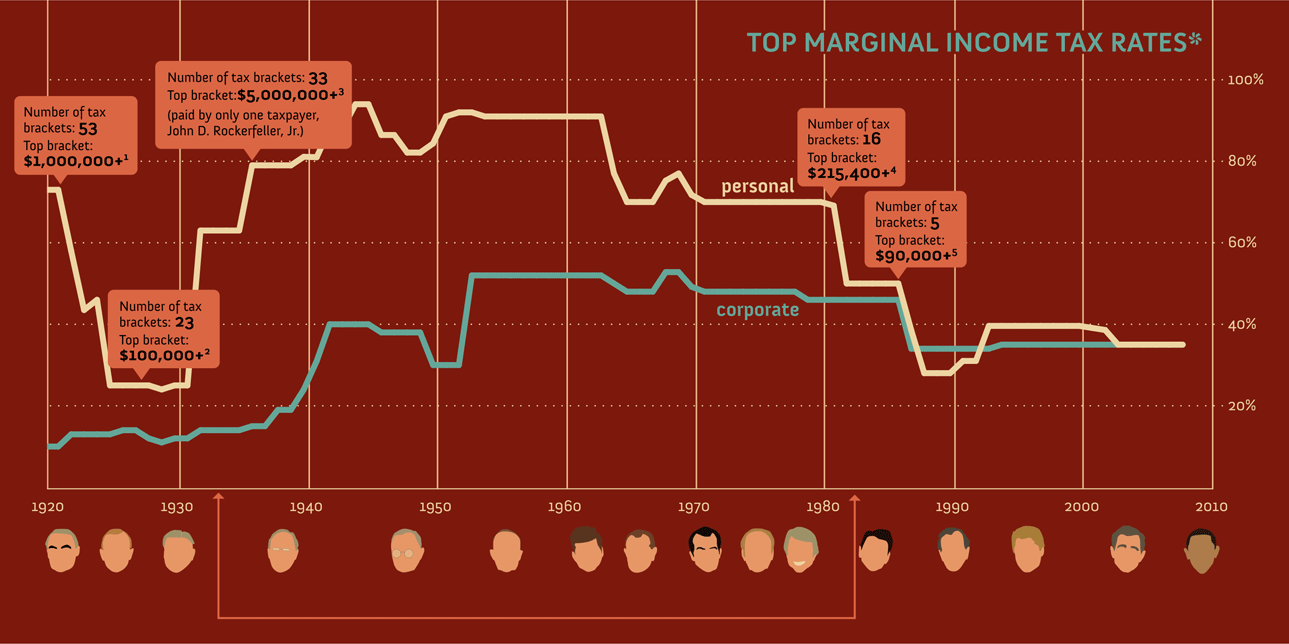
Curious about tax rates?
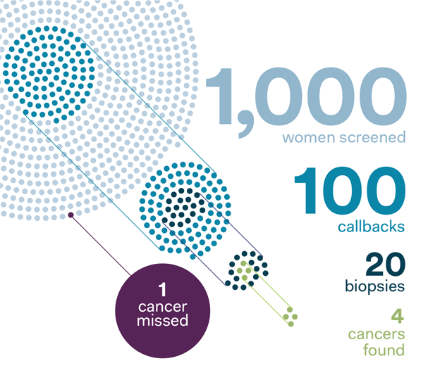
Sometimes the simplest diagrams can communicate the most, as does this depiction of mammogram screening statistics.
For Wharton’s Global Forums, Maskar developed graphics for their online announcement along with Powerpoint welcome screens at the actual event.